


byRituparna Nath Content Writer at Study Abroad Exams
GRE data analysis is also known as data interpretation. GRE data analysis is one of the four main concept areas in GRE quantitative reasoning. Data interpretation in GRE is the ability to interpret, or visualize data and make sense of the information given. GRE data analysis questions cover probability, statistics, and interpreting graphs. The data analysis GRE questions types may be Multiple-choice (both types) or Numeric Entry. The GRE test comprises twenty questions per math section. There are only three GRE Data Interpretation questions per section, leading to a total of six Data Interpretation questions on the test.
| Table of Contents |
GRE Data Analysis Questions Type
The GRE Data Interpretation questions come in more than one form. Hence, it would be ideal to learn GRE data interpretation in GRE formulas. The GRE Data Interpretation will present information in any one of a number of visual formats. These include:
- pie charts
- bar charts
- line graphs
- scatterplots & best-fit lines
- box plots
- histograms
- charts of numerical data
Here are the different types of data that candidates will come across on the data analysis in GRE test.
Pie charts are mostly called circle graphs because they are circular charts divided into sectors. The sectors demonstrate percentages or proportions of a quantity that is defined in the question itself.
Example: The pie chart illustrates browser penetration among internet users across Europe.
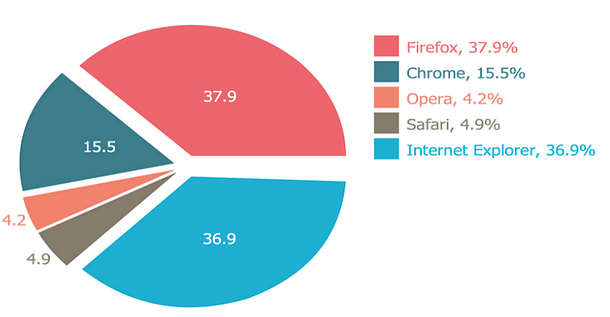
Candidates can use this information to answer any question thrown at them. For instance, if the question asks you to find the number of Chrome users given that the total number of users is 1 million. Then you can simply use your knowledge of percentages, and say that the number of Chrome users is 15.5% of 1,000,000 = 155,000.
Column charts are also known as bar charts. A bar chart is a kind of visual illustration that has rectangular bars with lengths proportional to the values they represent. The bars can be plotted vertically or horizontally.
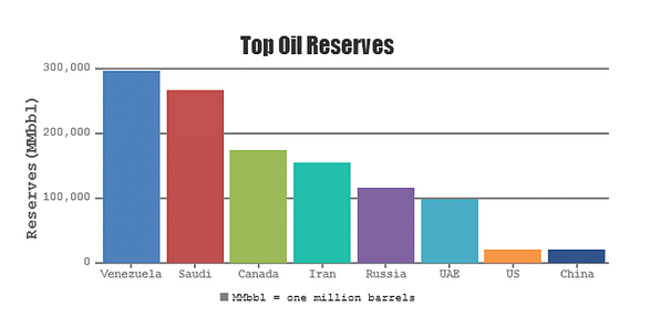
Example: In this graph, candidates can see how a bunch of countries compare when it comes to the number of oil reserves they hold. For instance, given that Venezuela has 300,000 million barrels of oil, and Iran has 150,000 million barrels. Then you can say that Venezuela has twice as much oil as Iran, or that the ratio of their oil reserves is 2:1. You may even be asked questions related to ratios, proportions, and percentages.
Line charts are usually shown on TV to compare the progress of two quantities.
Example: The GDP growth rates of two countries over time, or the performance of two stocks in the last quarter, and so on. Line graphs display the movement or growth of quantities.
Here is an example of a line graph

With such graphs, you will be asked questions like which year saw the maximum percentage change in share of voters. For the Democratic party, or the average percentage share of the voters for the Republican party from 1980 to 2010. You will be able to answer such questions easily if you are able to identify the data points correctly from the given line graphs.
Scatter plots are rarely seen on the GRE, compared to the other types of graphs that we discussed in this chapter so far. Scatter plots are useful to display bivariate data.
Example: age and weight of several persons on the same graph, or their annual income. Along with the amount of debt they carry, or their number of kids and number of cars, and so on.
For instance, a scatter plot may be used to show the number of hours studied by students In a university and the corresponding score in GRE Quant.

Using this graph, it is easy to answer any questions related to the information provided here. For example, you may be asked about the highest score in GRE quant among those who studied less than 30 hours.
Tips to Answer GRE Data Analysis Questions
Data interpretation GRE tips and tricks are the most required ones since that is the most difficult section. Here are a few tips that we have curated to answer the data interpretation questions:
- Scan the Data Presentation: Candidates must briefly scan the data to understand the question. But do not spend a lot of time studying all of the information in detail. Focus on the axes and scales of graphs, units, and orders of magnitude to any notes that clarify the data.
- Read the Scale Properly: When answering graphical data presentations read the scales, estimate, or compare quantities according to the corresponding scales. For instance, be aware of broken scales and of bars. As it is not accurate and does not start at 0.
- Know the Facts: The questions are to be answered only on the basis of the data presented. Do not mix the fact with any previous sample question.
GRE Data Interpretation Questions
GRE data interpretation needs to be thoroughly practiced. So along with the GRE practice questions, regular mock tests must be conducted. GRE data interpretation questions with solutions pdf are available in various books and online portals to accelerate the GRE preparation. Here are a few GRE data analysis practice questions:
Having said all that, solving GRE Data Interpretation questions is not so difficult either. If students are aware of the basic concept and the strategies needed to tackle specific questions on the test, then they should be in a safe spot.
*The article might have information for the previous academic years, which will be updated soon subject to the notification issued by the University/College.


Comments